Introduction
The MatDialog service can be used to open modal dialogs with Material design. It is very useful when you need to show some short messages. You can also put a Forms and other things.
Here, we use Material, so we need to install Angular Material in our project. If you want to know that how to install Material and interact with its module then you can check my blog here.
Need Of Dynamic Dialog:
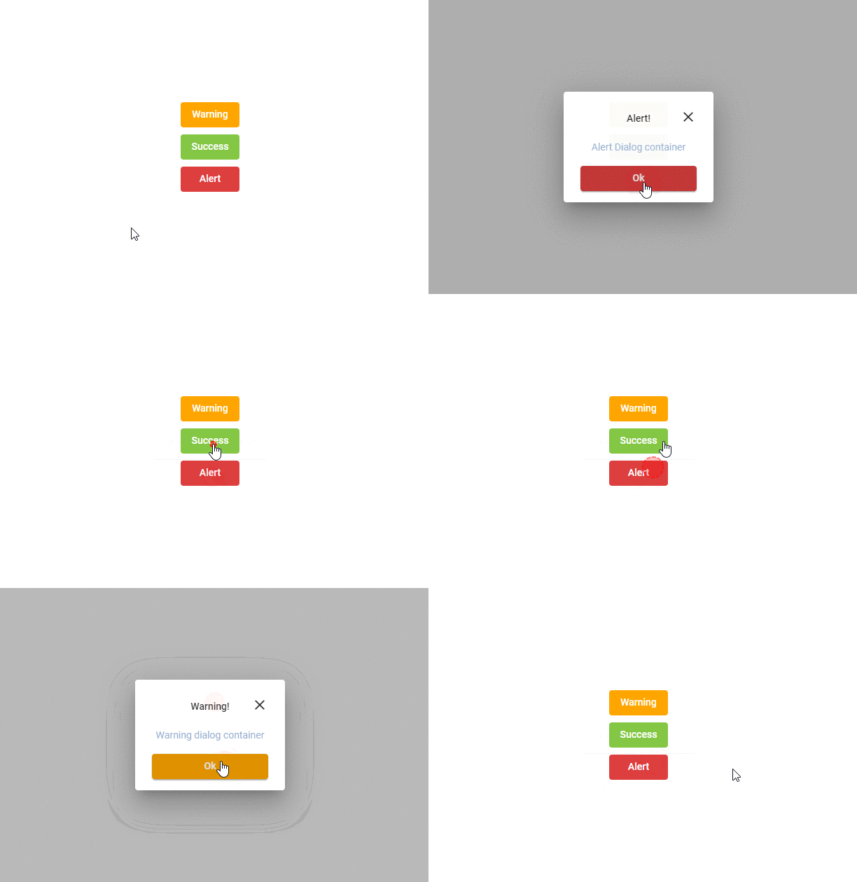
Consider you need to show some small information on your site. For example, you need to display three dialog box that is a success, warning, and alert.
So you need to create three different components for each. It looks very bad and consumes more space in your project. But here, we create only a single component and it works as a three Material-dialog box.
Let’s Start:
Here we send the data from our main component and maintain this data in our dialog box.
Step 1:
Create a new project and install the Angular Material in your project. Then import MatDialogModule in your app.module.ts file. We also need to create a second component for the dialog box.
Step 2:
Write the following code in your main component.
in app.component.ts
import { DynamicDialogComponent } from './dynamic-dialog/dynamic-dialog.component';
import { Component } from '@angular/core';
import { MatDialog } from '@angular/material/dialog';

@Component({
  selector: 'app-root',
  templateUrl: './app.component.html',
  styleUrls: ['./app.component.scss']
})
export class AppComponent {

  dialogData:any[] = [
    {
      id: 0,
      title: 'Alert!',
      contentMessage: 'Alert Dialog container',
      okButtonText: 'Ok',
      buttonColor:'#dd3e3e'
    },
    {
      id: 1,
      title: 'Warning!',
      contentMessage: 'Warning dialog container',
      okButtonText: 'Ok',
      buttonColor:'orange'
    },
    {
      id: 2,
      title: 'Success!',
      contentMessage: 'Success dialog container',
      okButtonText: 'Ok',
      buttonColor:'#83c745'
    }
  ];

  constructor(public dialog: MatDialog) {}

  openDialog(index:any) {
    this.dialog.open(DynamicDialogComponent,{data: this.dialogData[index] });
  }

}
in app.component.html
<div class="container">
  <button mat-button (click)="openDialog(1)" class="warning-button">Warning</button>
  <button mat-button (click)="openDialog(2)" class="success-button">Success</button>
  <button mat-button (click)="openDialog(0)" class="alert-button">Alert</button>
</div>
That’s all set. Now, we write some code to our dialog component.
In your dynamic-dialog.component.ts
import { Component, Inject, OnInit } from '@angular/core';
import { MAT_DIALOG_DATA } from '@angular/material/dialog';

@Component({
  selector: 'app-dynamic-dialog',
  templateUrl: './dynamic-dialog.component.html',
  styleUrls: ['./dynamic-dialog.component.scss']
})
export class DynamicDialogComponent implements OnInit {

  constructor(
    @Inject(MAT_DIALOG_DATA) public data: any
  ) { }

  ngOnInit(): void {
    this.changeButtonColor(this.data);
  }

  changeButtonColor(data: any) {
    let button = document.getElementById('ok');
   if(button){
    button.style.backgroundColor = data.buttonColor;
   }
  }

}
in dynamic-dialog.component.html
<div class="mdc-layout-grid grid-padding">
    <div class="mdc-layout-grid__inner">
        <div class="mdc-layout-grid__cell--span-12 success-title">
            <div></div>
            <div class="success-text">
                {{data?.title}}
            </div>
            <div mat-dialog-close class="close-icon">
                <mat-icon>close</mat-icon>
            </div>
        </div>
        <div class="mdc-layout-grid__cell--span-12 description-text">
            {{data?.contentMessage}}
        </div>
        <div mat-dialog-actions class="mdc-layout-grid__cell--span-12 success-job-button">
            <button mat-raised-button mat-dialog-close class="ok-button" id="ok">Ok</button>
        </div>
    </div>
</div>

Conclusion:
In this article, we learn about mat dialog, why we need the dynamic dialog box, the use of dynamic dialog box, and how to implement it in our Angular project. We also see that how to pass data to the Material dialog.


